Pedal & Scoop
Brand Touchpoints:
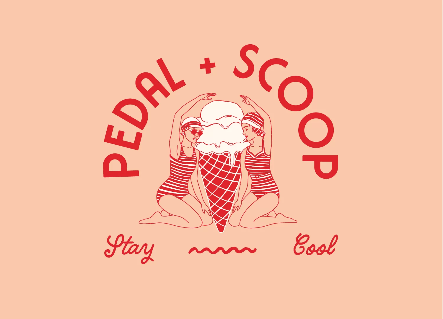
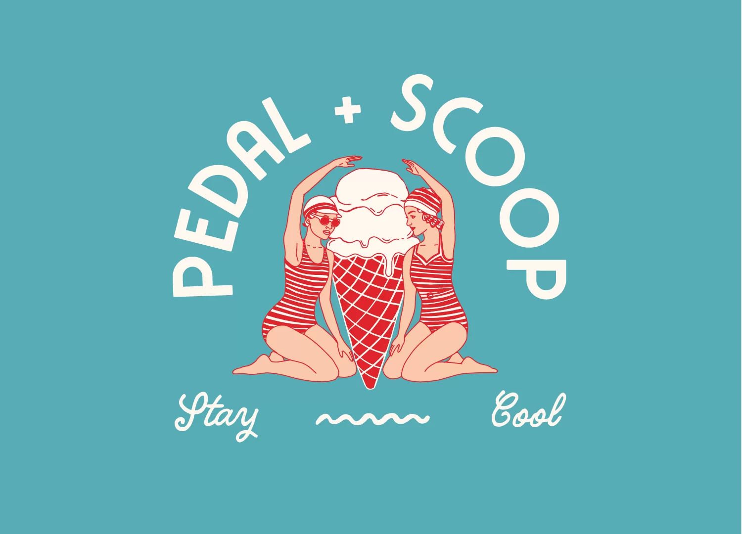
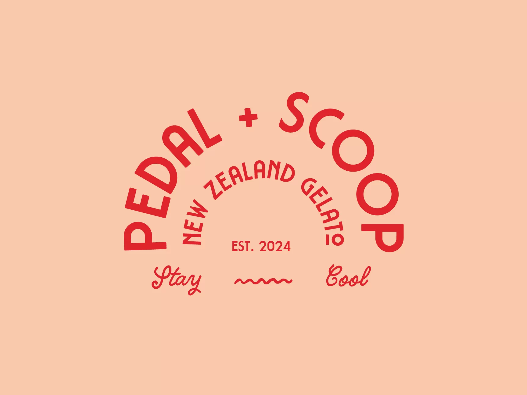
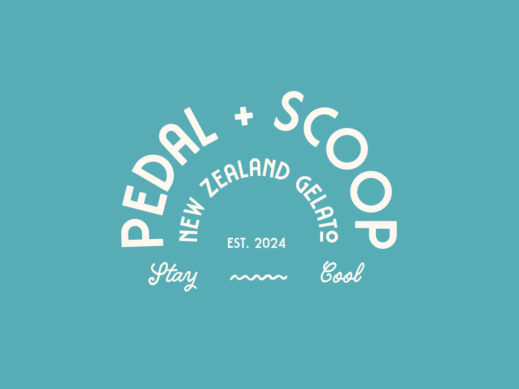
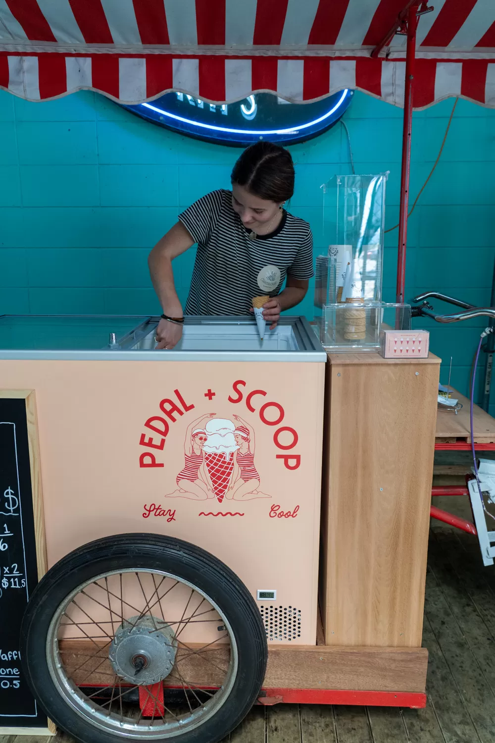
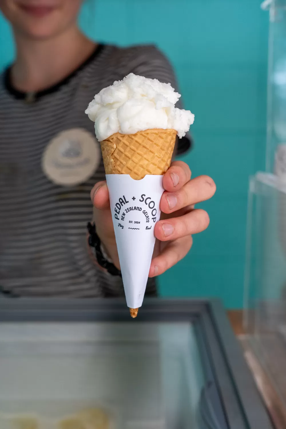
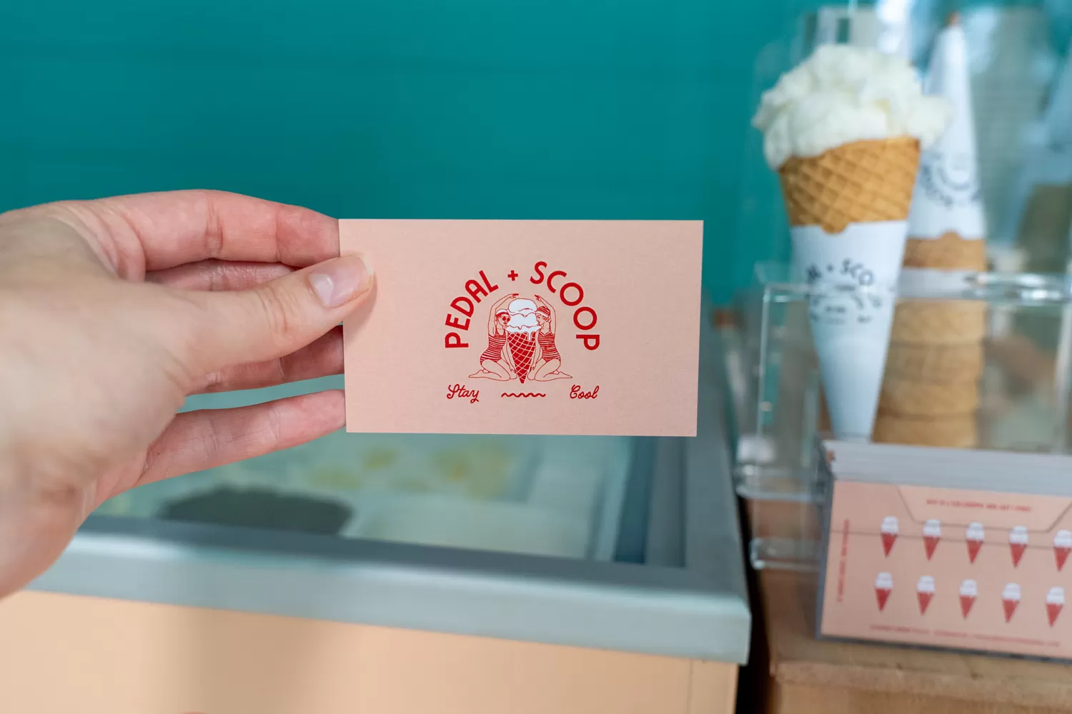
Branding. Design. Signage.Scooping up a Fresh Look
When launching Pedal & Scoop, the team had a clear vision for their brand—a unique and eye-catching logo that captured their personality. However, translating that vision into a cohesive brand identity was the challenge. Our job was to take their ideas, refine them, and bring them to life in a way that felt true to their style.
We worked closely with Pedal & Scoop, presenting multiple visual directions through curated mood boards. Each option reflected different elements of their inspiration, making it difficult to choose! The final design was a perfect mix of their favourite aspects, resulting in a fun, fresh, and memorable brand that stands out.
The outcome? A logo and brand identity that truly reflects Pedal & Scoop’s vision—bold, playful, and full of personality. Seeing their dream come to life with an identity they love is exactly why we do what we do.